UX/UI Design & Branding
Inovative Solutions
Techlinija
From the client’s mouth
„The expertise Agnė showed while creating our brand and during later consultations was not only invaluable but also deeply human. She gave us clear direction and also discussed the KPIs behind each decision. That was incredibly helpful for building a new brand.”
UX/UI Design & Branding
Jewelry store
Momentas
Techlinija
Scroll Down to See Project
From the client’s mouth
“I really loved working with Agnė. She is a very creative-minded woman, and her attention to detail was noticeable at a glance. She delivered on time and helped shape our internal brand vision.”
First things first
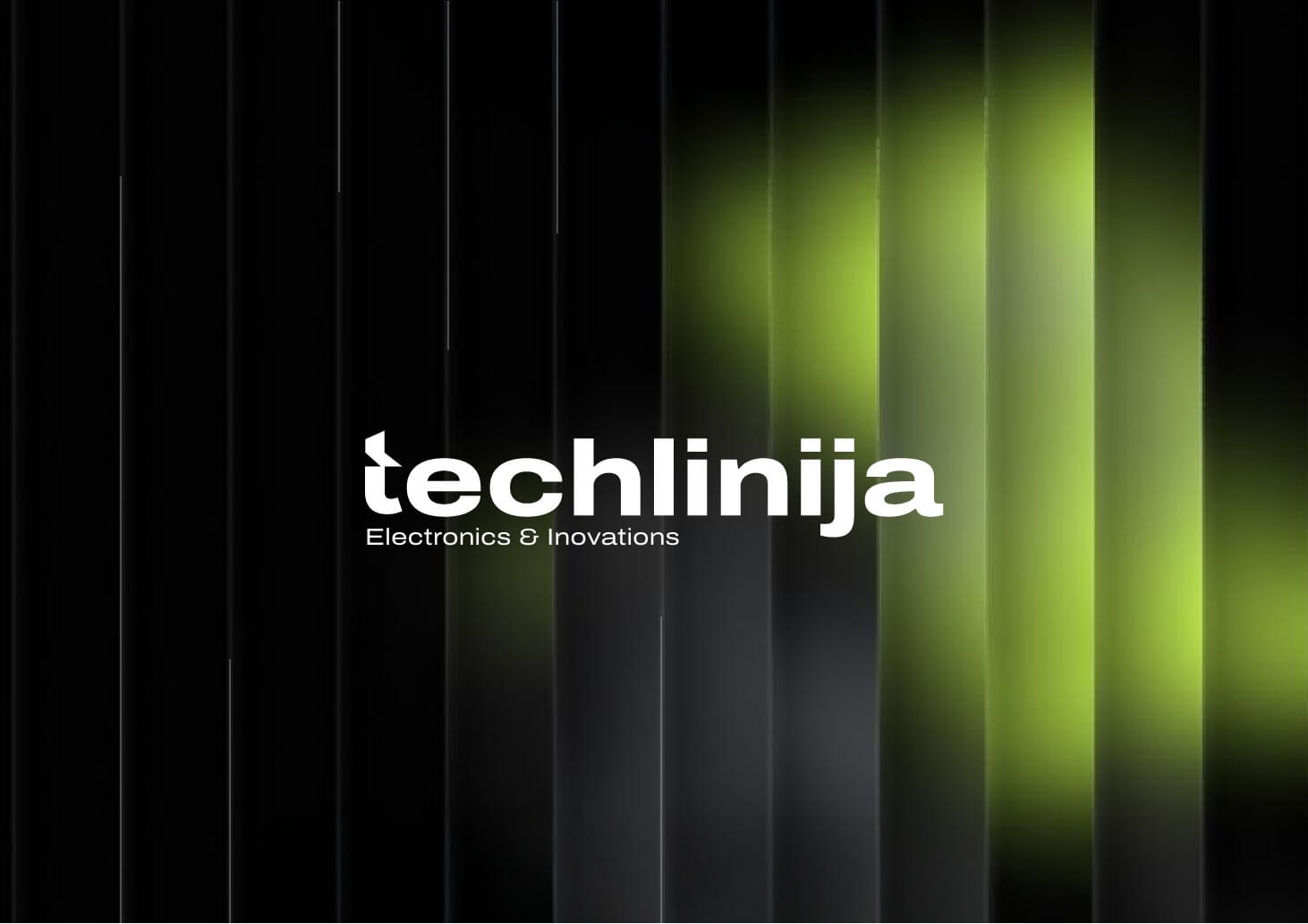
Our journey with a client started with the logotype creation procesess. I was happy to have easy client, client new what they want but still trusted my as a designer desitions.
“Modern, clean, with and with minimalistic tweek touch.” This was the words i was given on the kick off call.
Modern touch of strong bold wide font created stability feeling.The moving foward pointing haf of arrow small detail on the “t” was that small tweek that made brand alive and made it intresting. Letter “t” later on became an icon itself, that represented a brand when there was no neewd of full logotype.
Modern and techbased
Since the company did not want to put their service in clear frames, i worked in cloudy direction. While working on a branding I new that we have to make it clear, yet misteriuos. development usualy goeas with the dark scene,. But i had to bring the light to it as well to gain that feel of invoation. i thoughtfully presented to the client green mat light that shine wthrought the black together as a symbol of the green light to inovations, the new beginnigns and the fresh start in the dark unown fields.
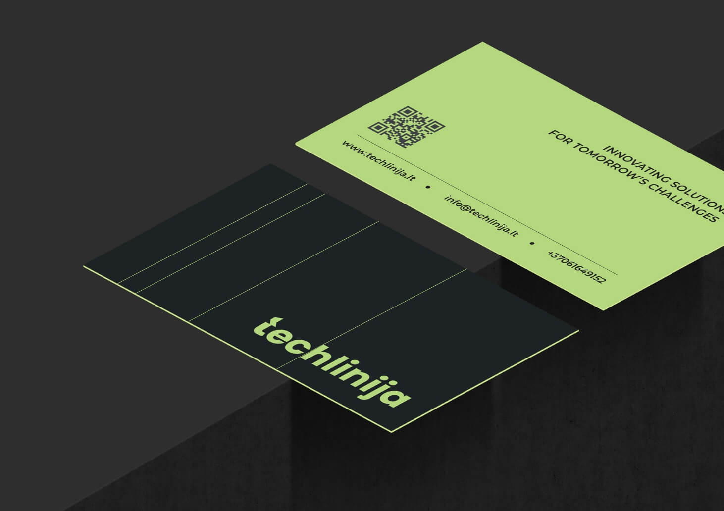
lines all over the place
The final touch of the branding was lines motives. That reflectied 3d printer inovations, lasers and constantly moving forward. From presise lines on business cards, abstract faces on home hero, to the outiline dev board to represent the company services in a sublte way.
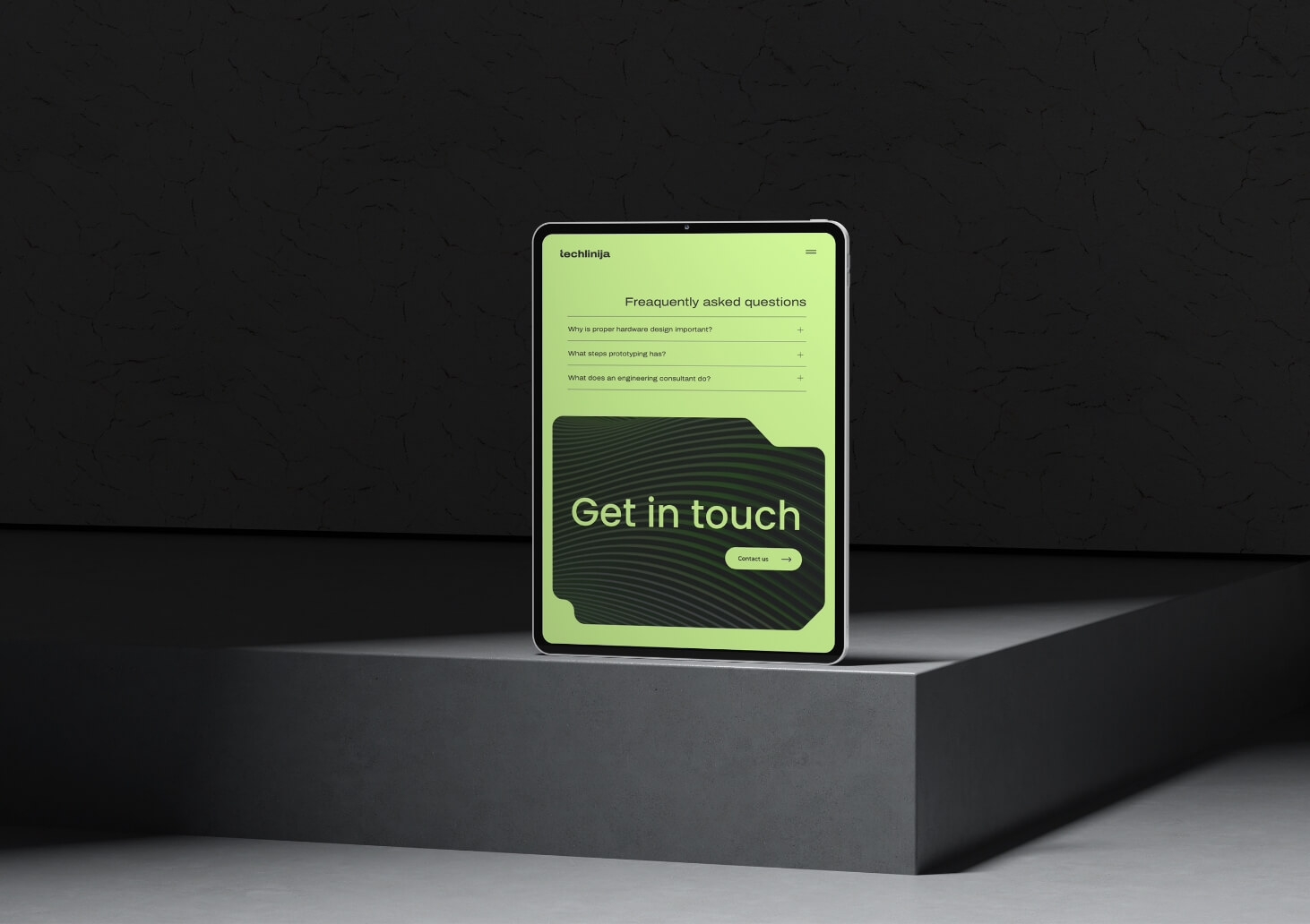
Everything for a user.
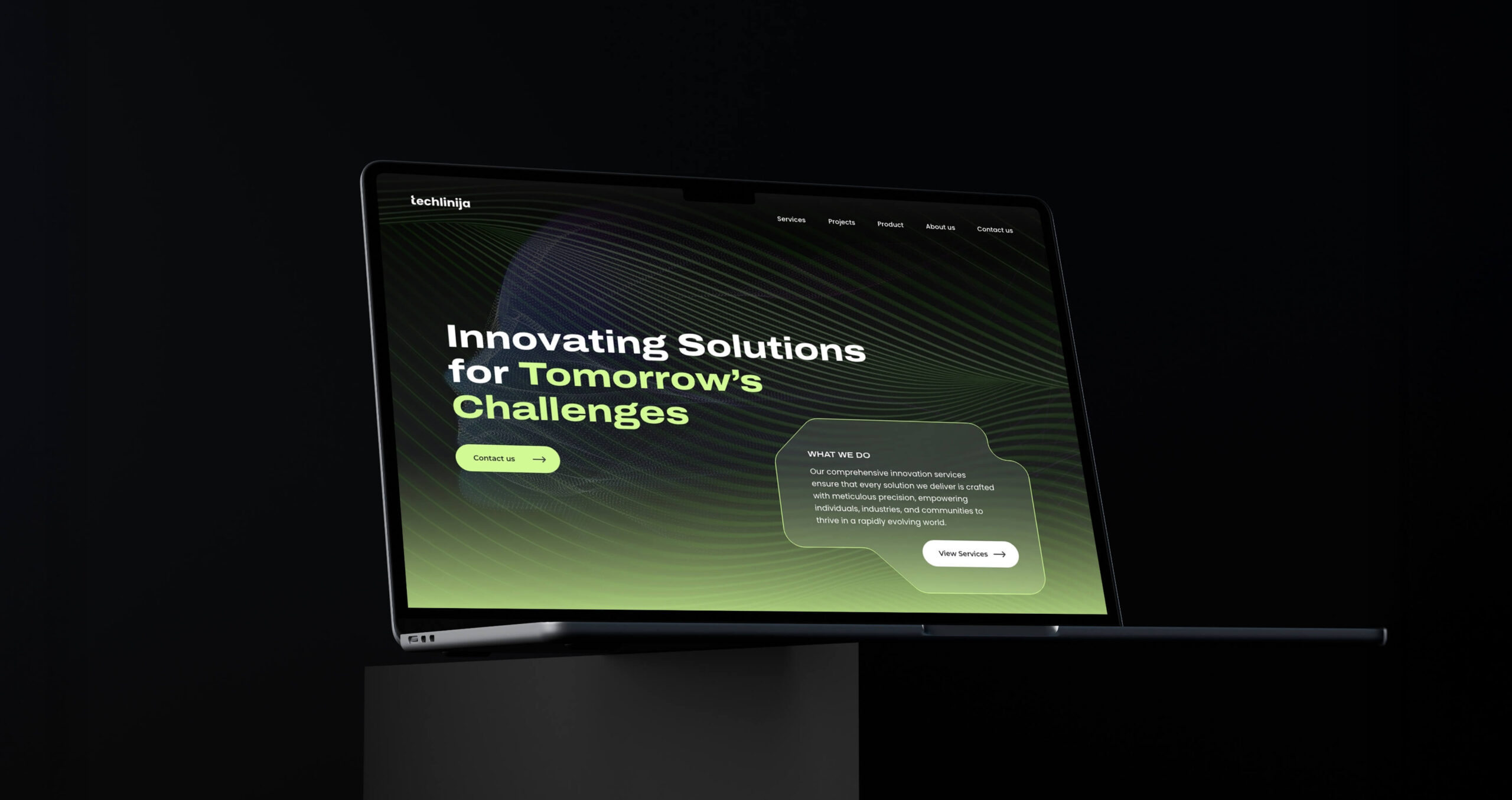
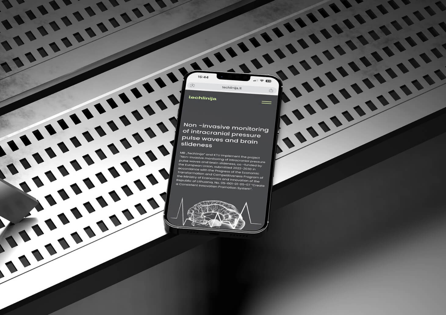
While having all of the website dark we wanted to give opportunity for a reader to feel more comfortable while reading. So came up with idea to let user swith to light mode on article pages.
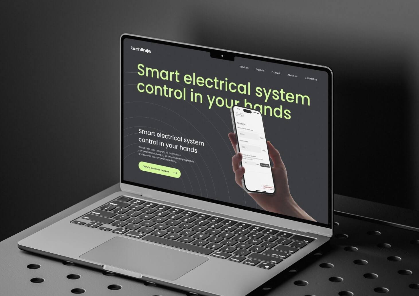
landing page for product
After website was released client came back with a ask of landing page for their new product. Having a strong base of branding it was easy to do, Based on the best ux/ui practises for landing pages, was build structure that included, call to action, benefiits, why its worth to buy and pre order actions. together with prototype mockups leading to best representaion and upcoming conversions conversion.
Give opportunity for your brand to shine. Contact.
Give opportunity for your brand to shine. Contact.
Next project
Gabu
Taking care of jewellery is just as important as buying it. That’s why I created a simple, minimal packaging design for a jewellery cleaning napkin. It’s a small product, but it plays a big role in showing the brand’s attention to detail. I focused on highlighting the Momentas name, keeping the look clean and elegant.
