UX/UI Design & Branding
Vin Patikra
From the client’s mouth
„Everything was great. We came for a website design but ended up with fully shaped branding — from colors to a clear message. Highly recommended!”
UX/UI Design & Branding
Vin Patikra
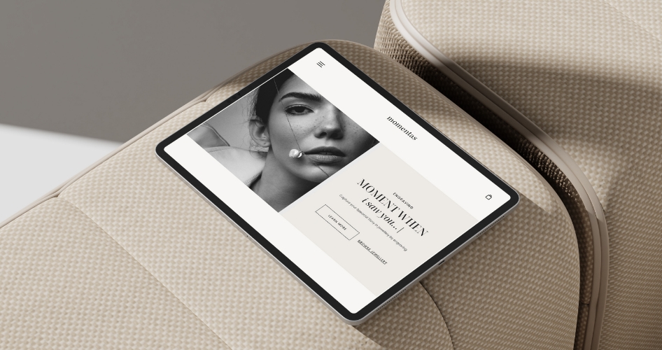
Jewelry store
Momentas
Scroll Down to See Project
From the client’s mouth
„Everything was great. We came for a website design but ended up with fully shaped branding — from colors to a clear message. Highly recommended!”

Selling Point and User Connection
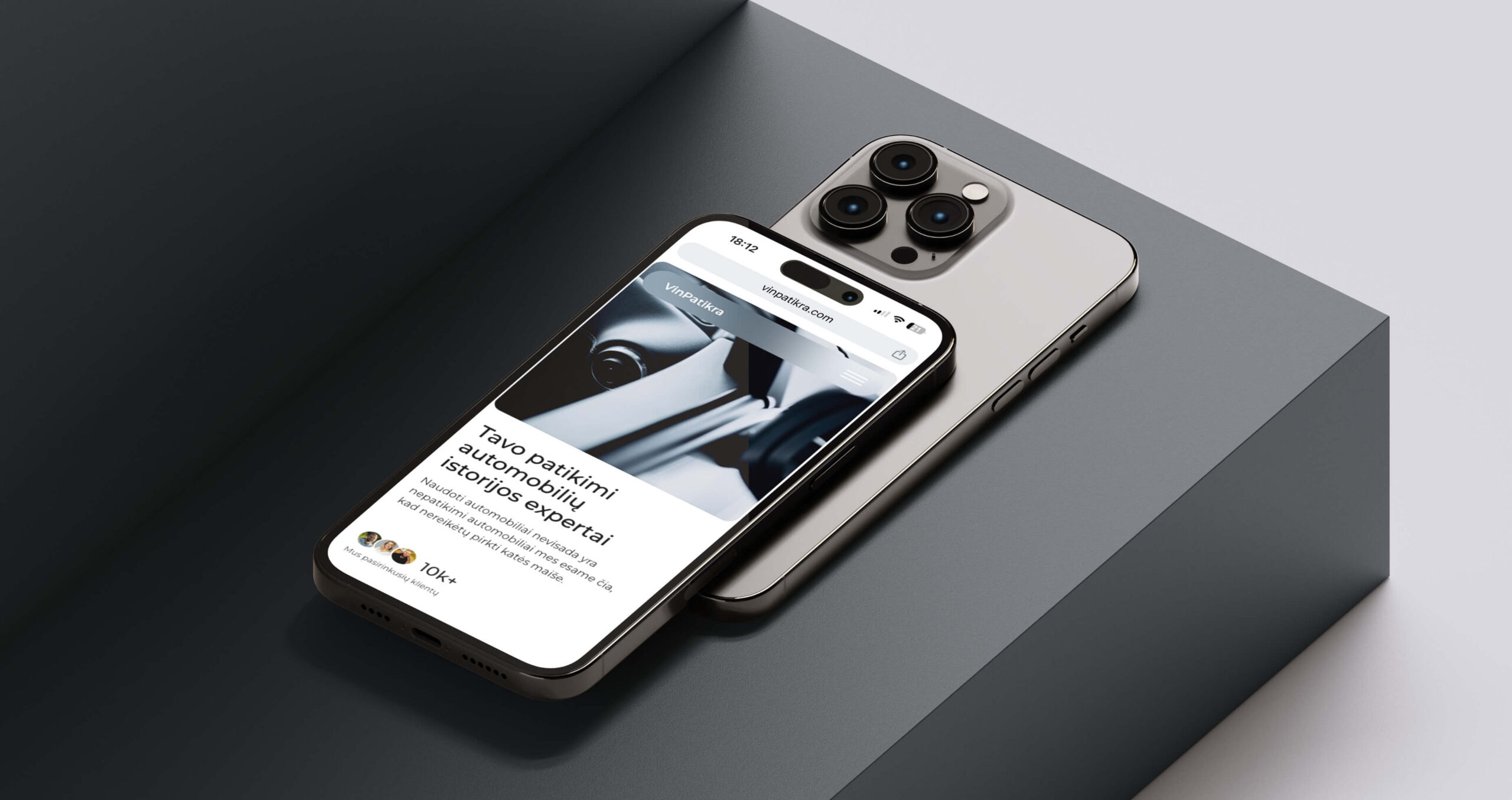
Taking the target audience into account, people buying used cars, I created an emotional and impactful call to action supported by strong visuals. The main message is simple and direct: Protect your loved ones.
This single CTA speaks to users’ emotions, not just their logic. Visually, it shows a happy family contrasted with subtle scenes of risk like accidents, water damage, and breakdowns. The goal is to create just enough tension to make users stop and think: Is this car really safe? That emotional pull leads them to take action. With Vin Patikra, all it takes is entering the VIN to uncover the car’s full history before making a decision. Primary call to action was orentied to tied with emotion and led to pricing and plans selection step of the flow and the Second call to action was orentied to one click to conversion.
Strategy in One Fold
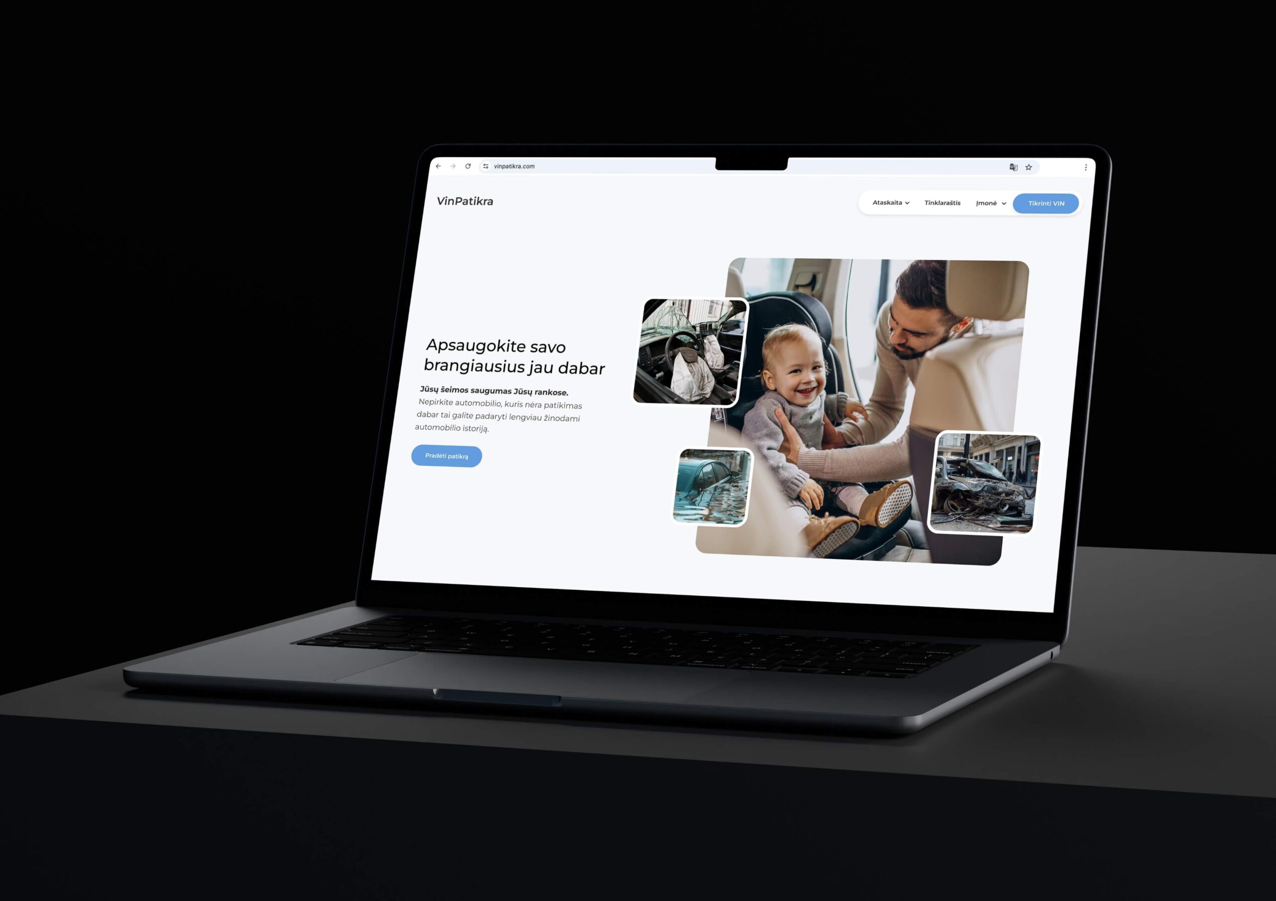
To make the most of the pricing page, I created a strategy that delivers everything within a single screen. We used price differentials to guide users toward the most valuable plan by making the best offer visually stand out. A trust-building pull quote added credibility, while the most common “how does this work” questions were answered right away using a quote mark symbol for clear navigation.
I also included details about what users actually receive after purchasing the service. Clear value, no confusion, and no need to ask more questions. The layout was built to help people make quick, confident decisions.
Information Architecture for Seamless User Flow
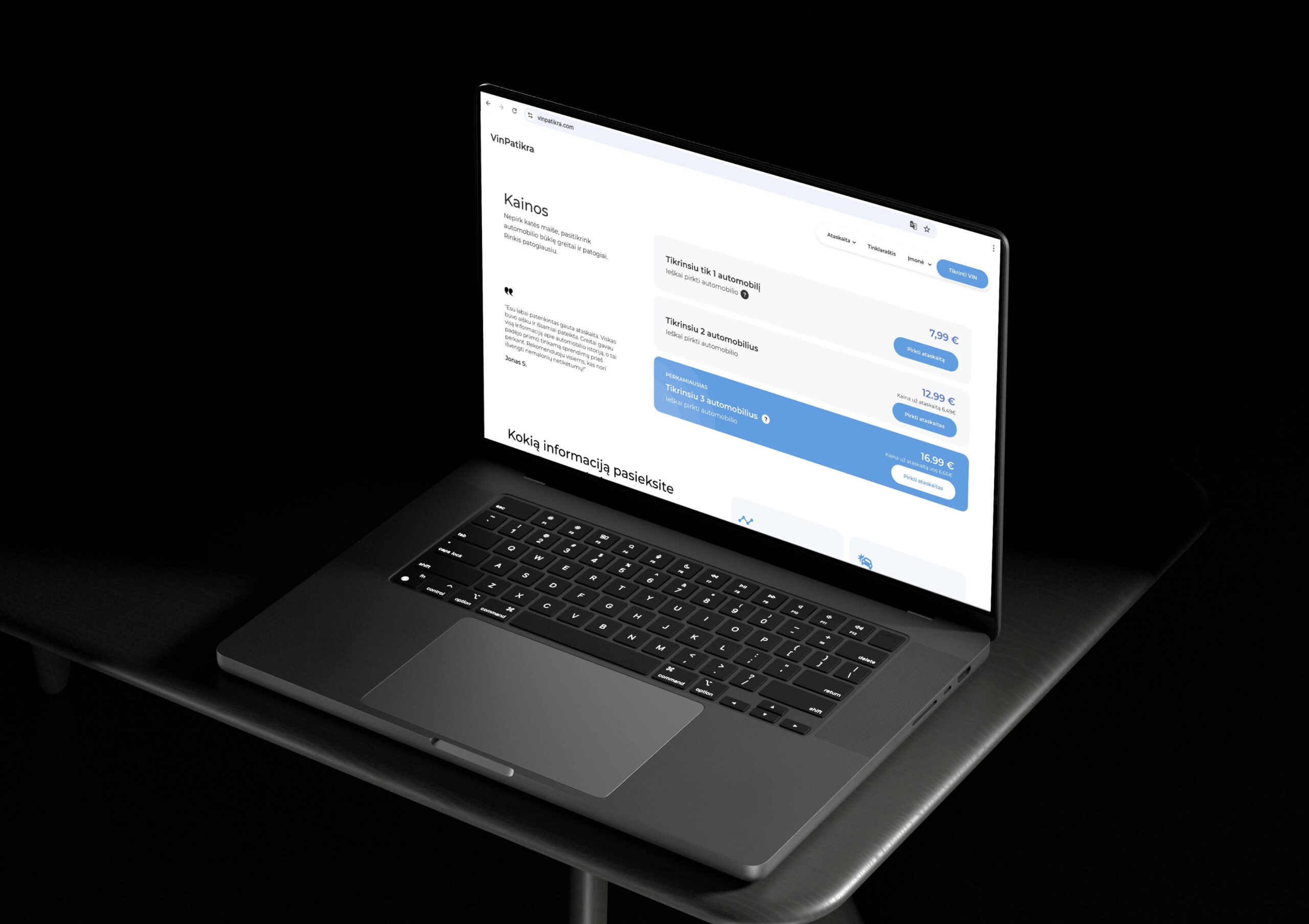
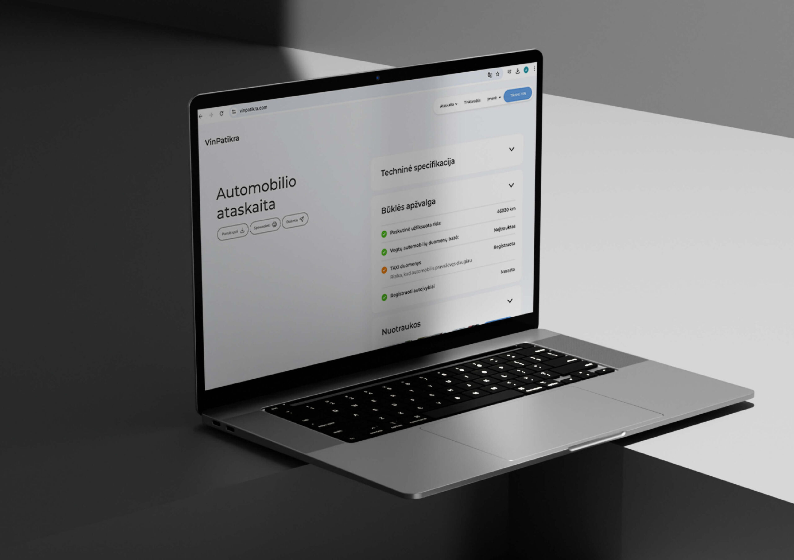
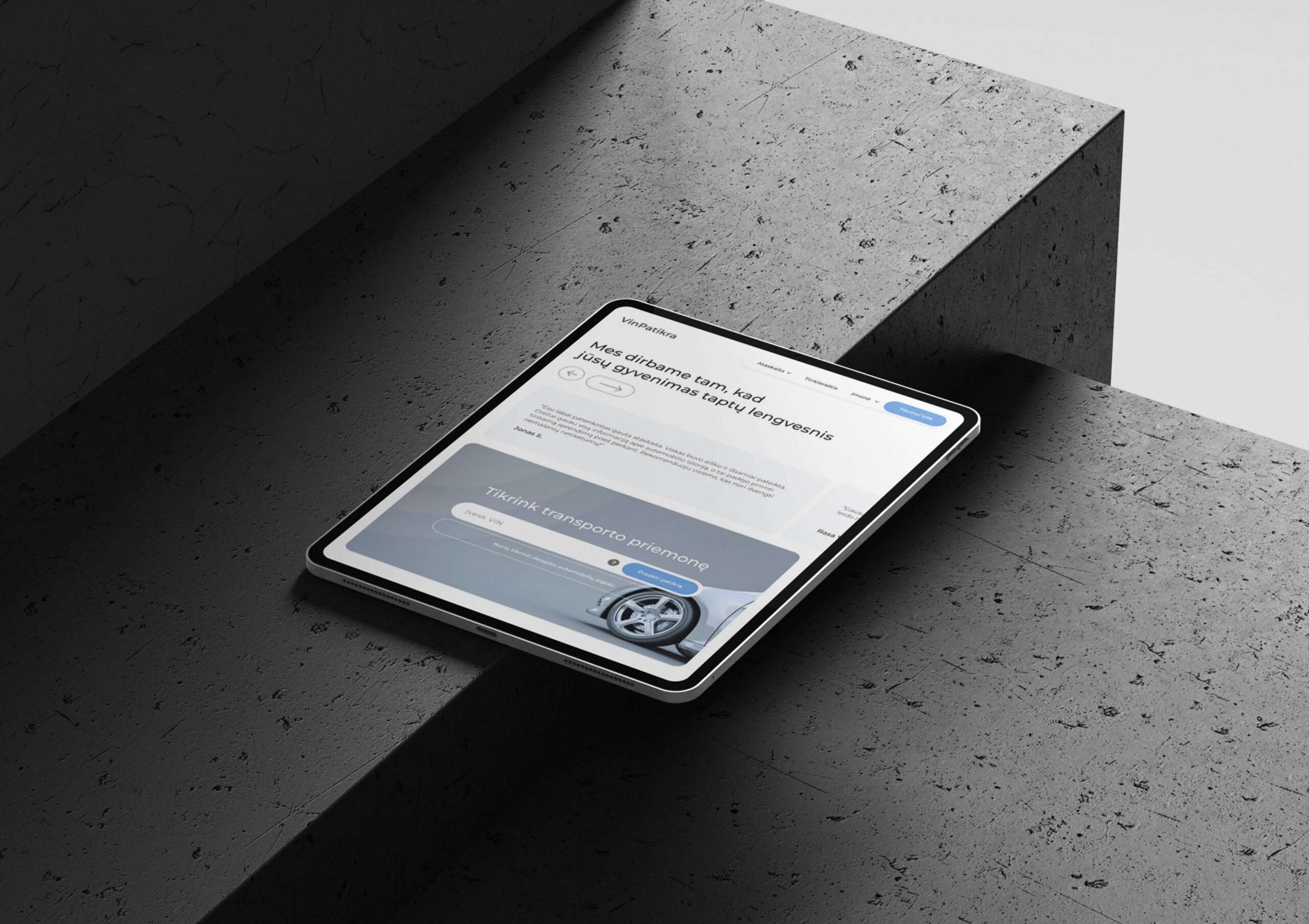
A key objective was to provide users with a structured, seamless car history analysis accessible on any device. Previously, the report was a simple PDF without organization, which led to confusion. To improve this, I implemented a categorized, sectioned layout with intuitive accordion-style information panels, making it easy for users to navigate.
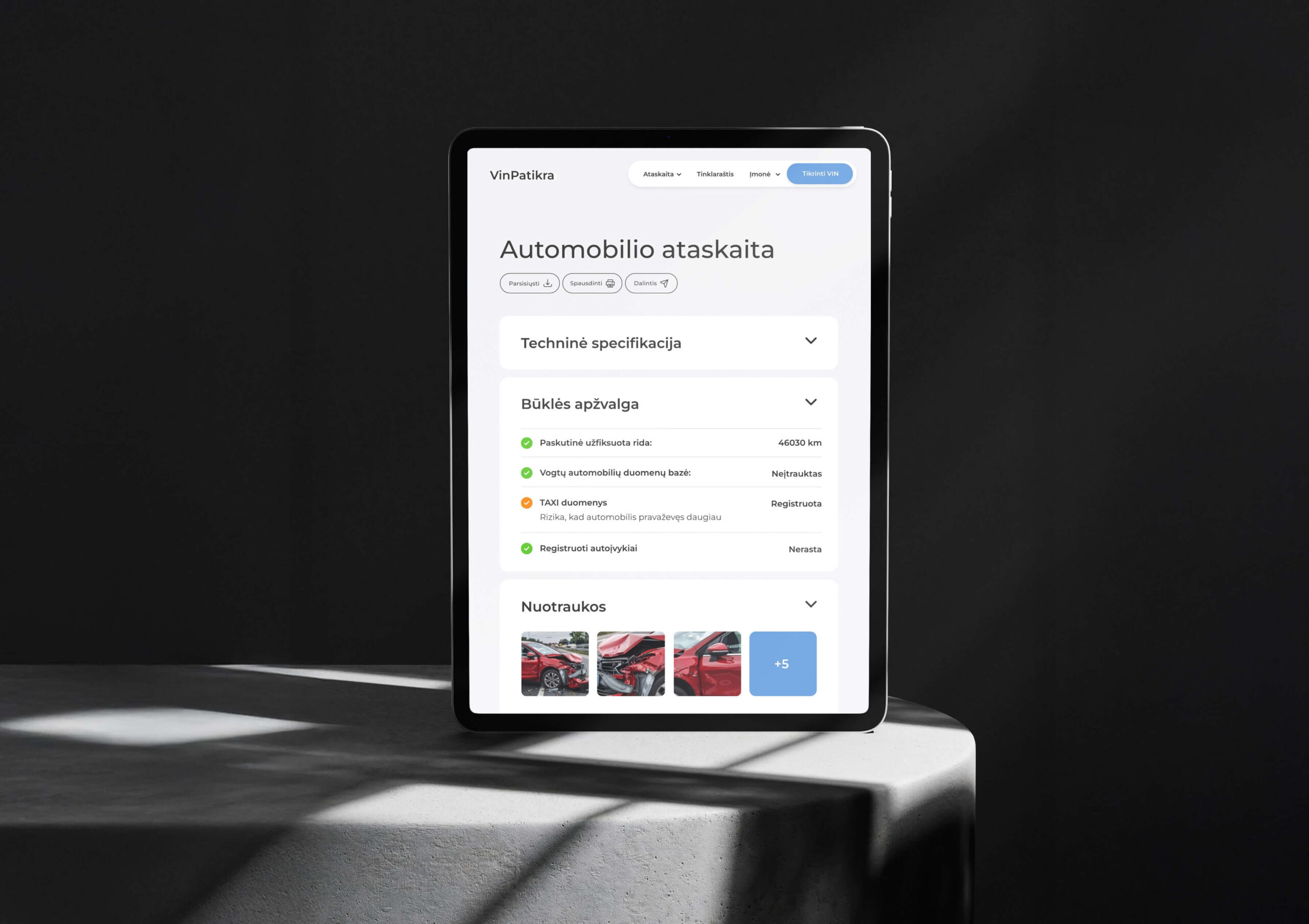
Alerts and responsiveness
The design also included a color-coded alert system, allowing critical information to stand out immediately. I ensured the document was fully functional, offering users the ability to print, share, and download their report effortlessly. This structure not only improved usability on desktop but was also optimized for mobile and tablet devices, delivering a streamlined experience across all platforms.
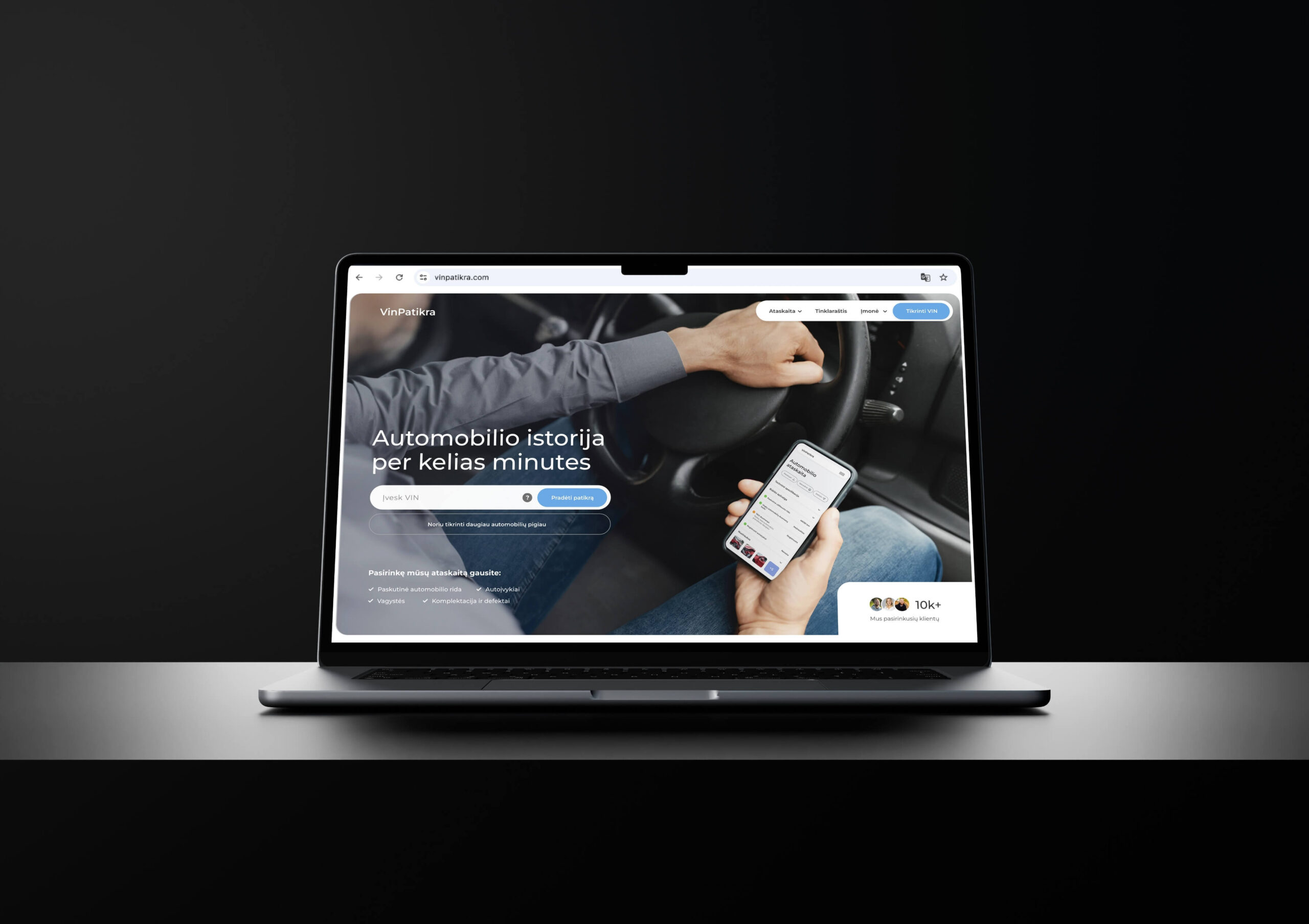
Clarity and Trust
Transparency is key when it comes to building user confidence. To establish credibility right away, I placed a mockup of the final report directly in the hero section, so users could see exactly what they would receive. This immediate clarity helped set expectations and reduce hesitation.
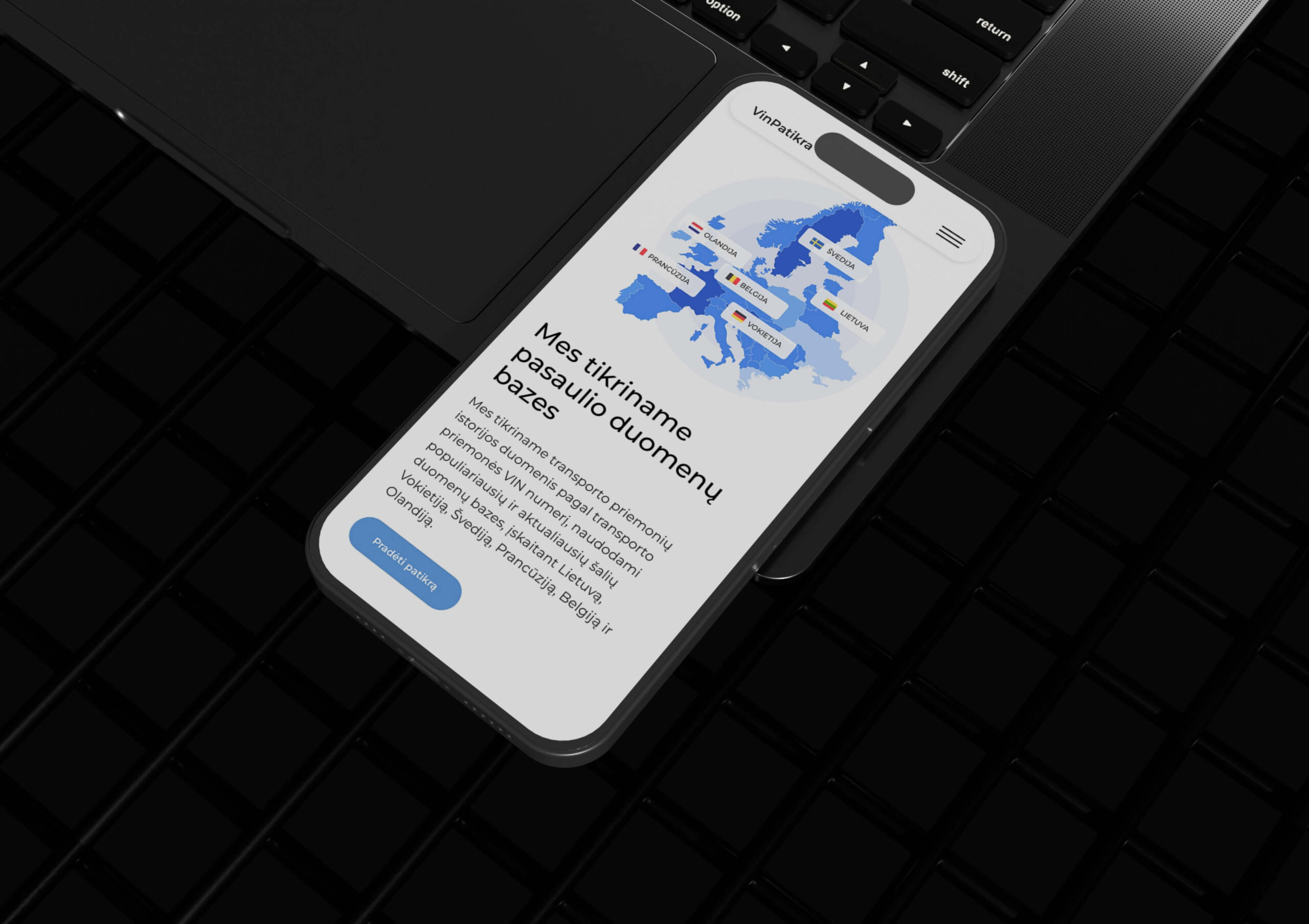
To strengthen trust even further, I added real testimonials and usage statistics as social proof. We also included a map highlighting the countries from which the vehicle data is sourced. This gave users a deeper understanding of the report’s reach and reliability, reinforcing the value of what they’re paying for.
Identity
The user journey was designed to feel simple from the start—just type in the VIN and purchase. But behind that simplicity is a thoughtful visual and emotional strategy. Throughout the website, I used a ripple effect as a subtle symbol of connection and the reach of reliable information. Combined with a blue color palette, the design communicated trust, clarity, and calm
Give opportunity for your brand to shine. Contact.
Give opportunity for your brand to shine. Contact.
Next project
Momentas
Taking care of jewellery is just as important as buying it. That’s why I created a simple, minimal packaging design for a jewellery cleaning napkin. It’s a small product, but it plays a big role in showing the brand’s attention to detail. I focused on highlighting the Momentas name, keeping the look clean and elegant.
